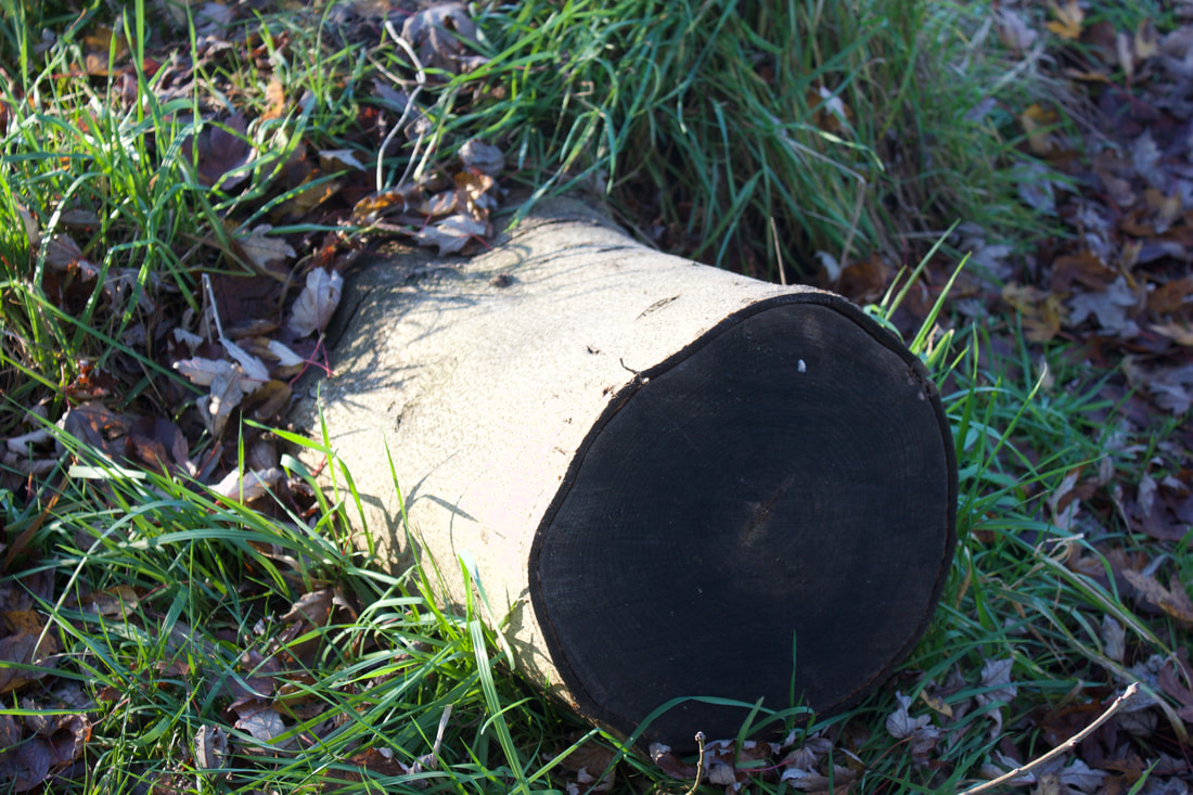
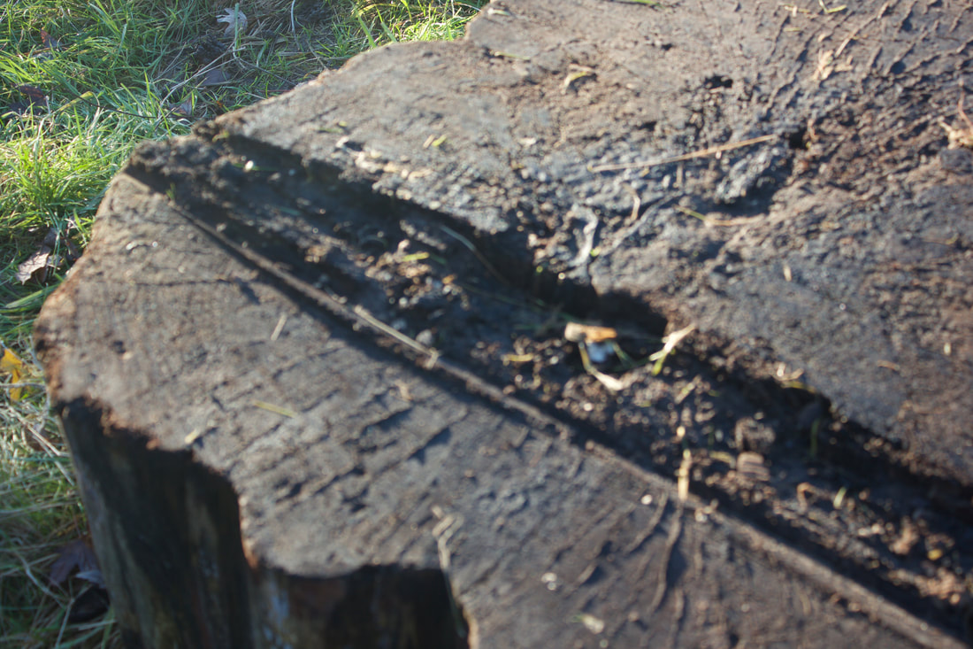
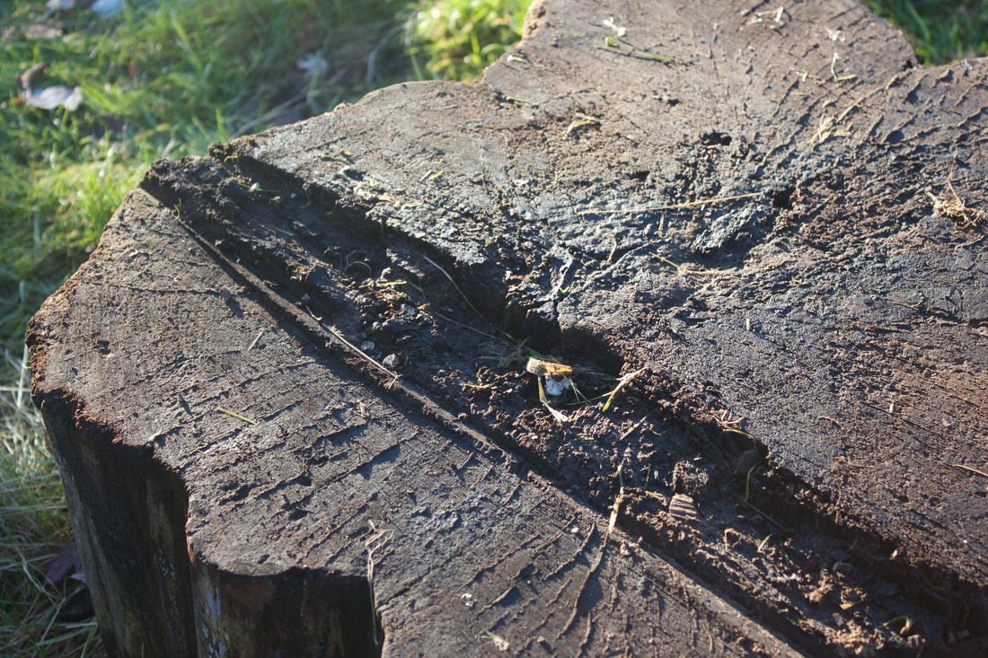
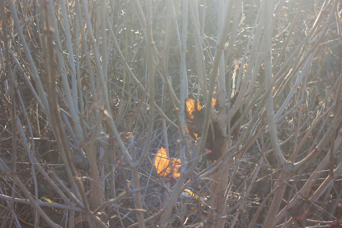
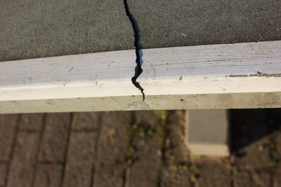
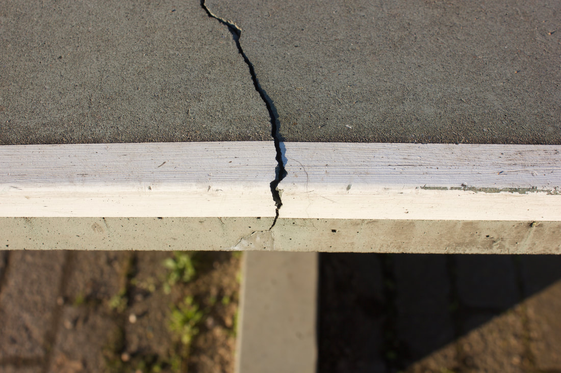
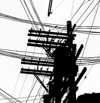
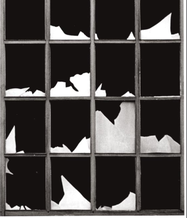
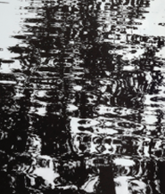
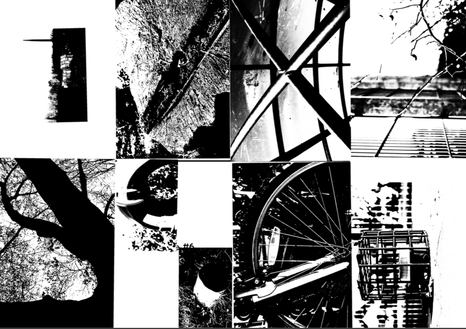
Keld was an artist who really focused on high contrasting, industrial meaningful photos. He brought attention to the very strong and bold outlining of the photos, most lines are very eye-catching to us as audience because of their straight and shaping forms. The high contrast in his work, in my opinion adds a lot of drama and conflict between black light. Keld Helmer Peterson was famous for his colourful photography, however he also managed to create several books of black and white photography, although his photos were not just "black and white". His photos include a very high contrast as said before, which differs to other photographers works where they just have a black and white photo and it looks non abstract and we as audience can pretty much use common sense to work out what colours were supposed to be in place of the black and white grading. In his work, the audience have to actually look closely and think more to firstly work out what exactly his work is showing, and then to guess the colours, but that is not the point that he tries to get across to us.
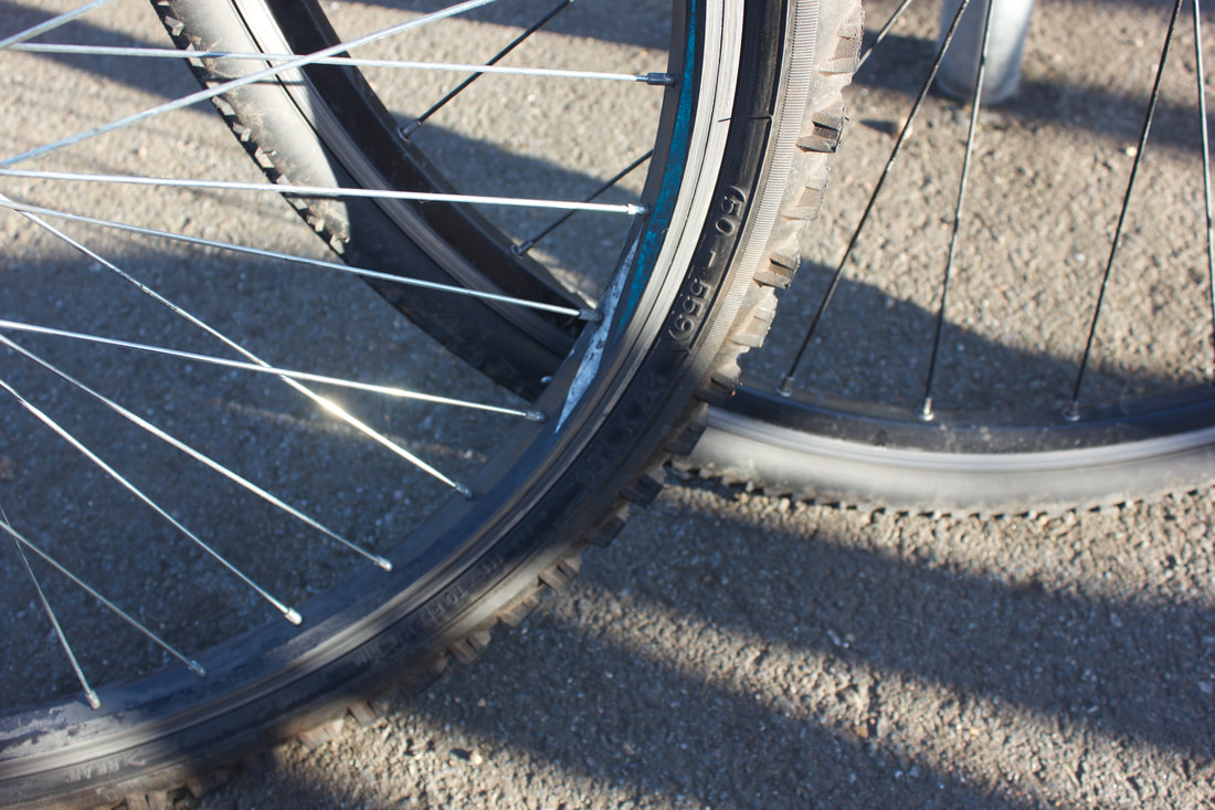
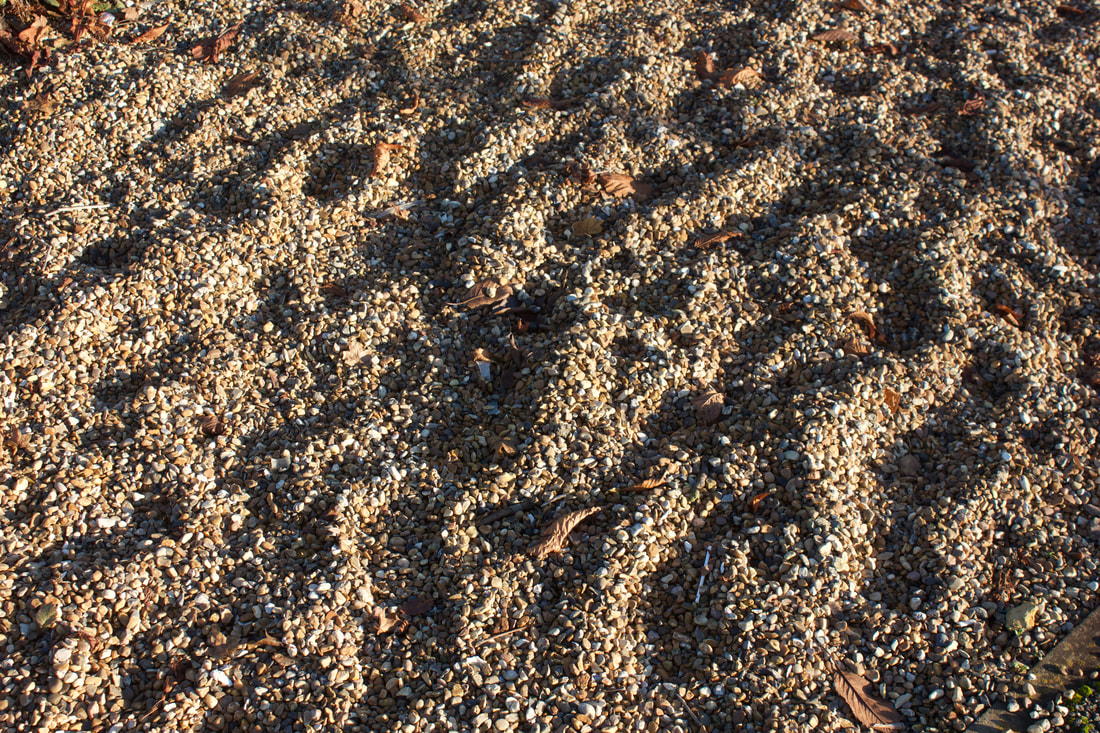
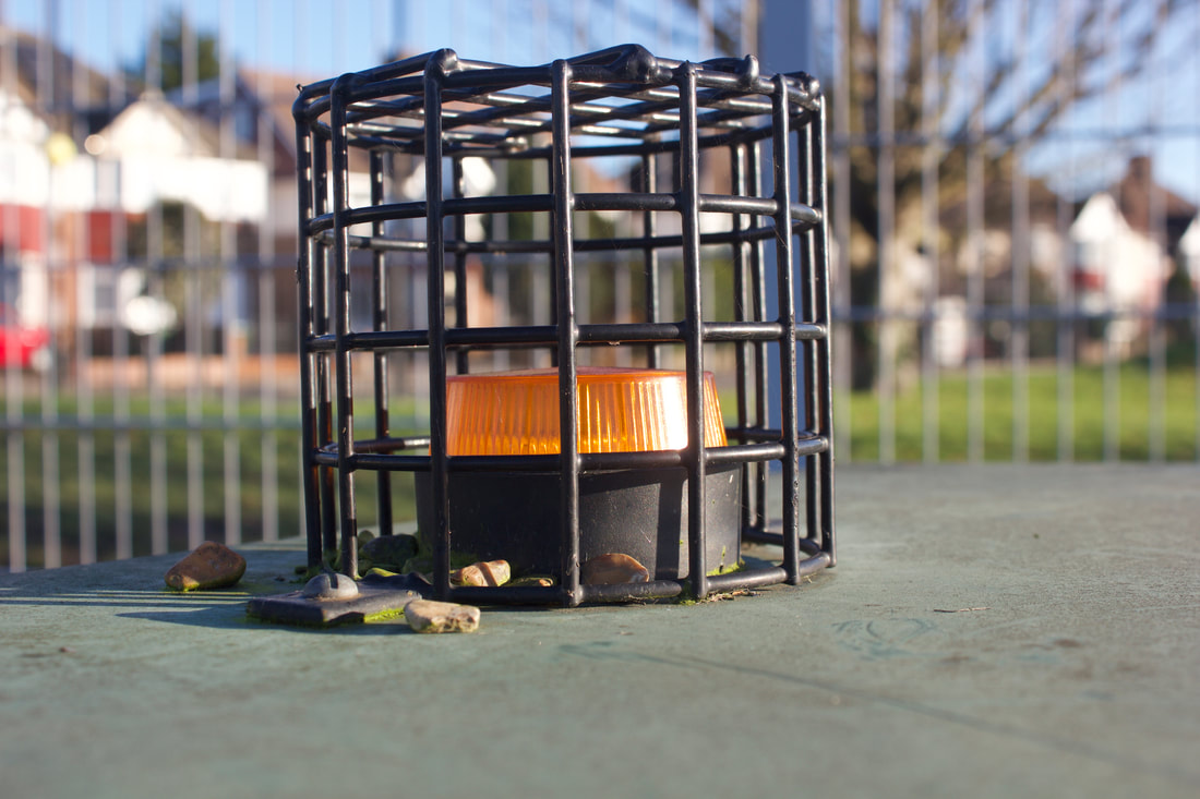
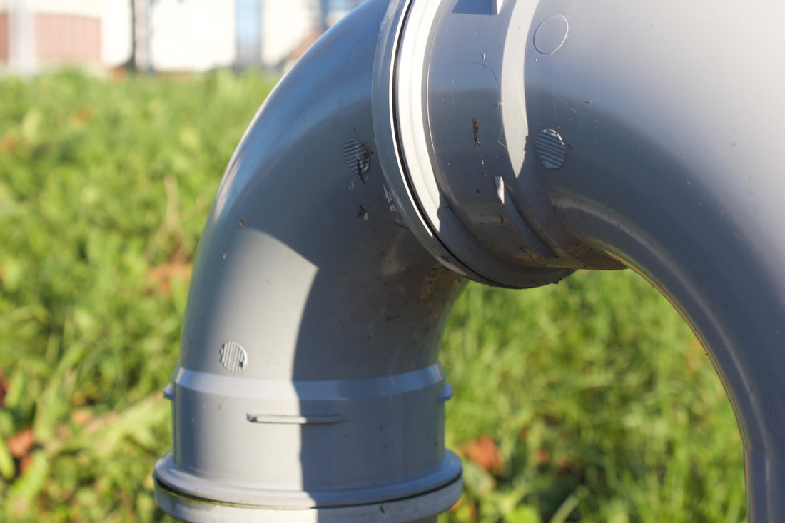
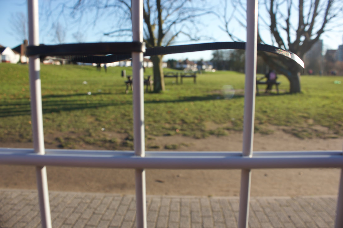
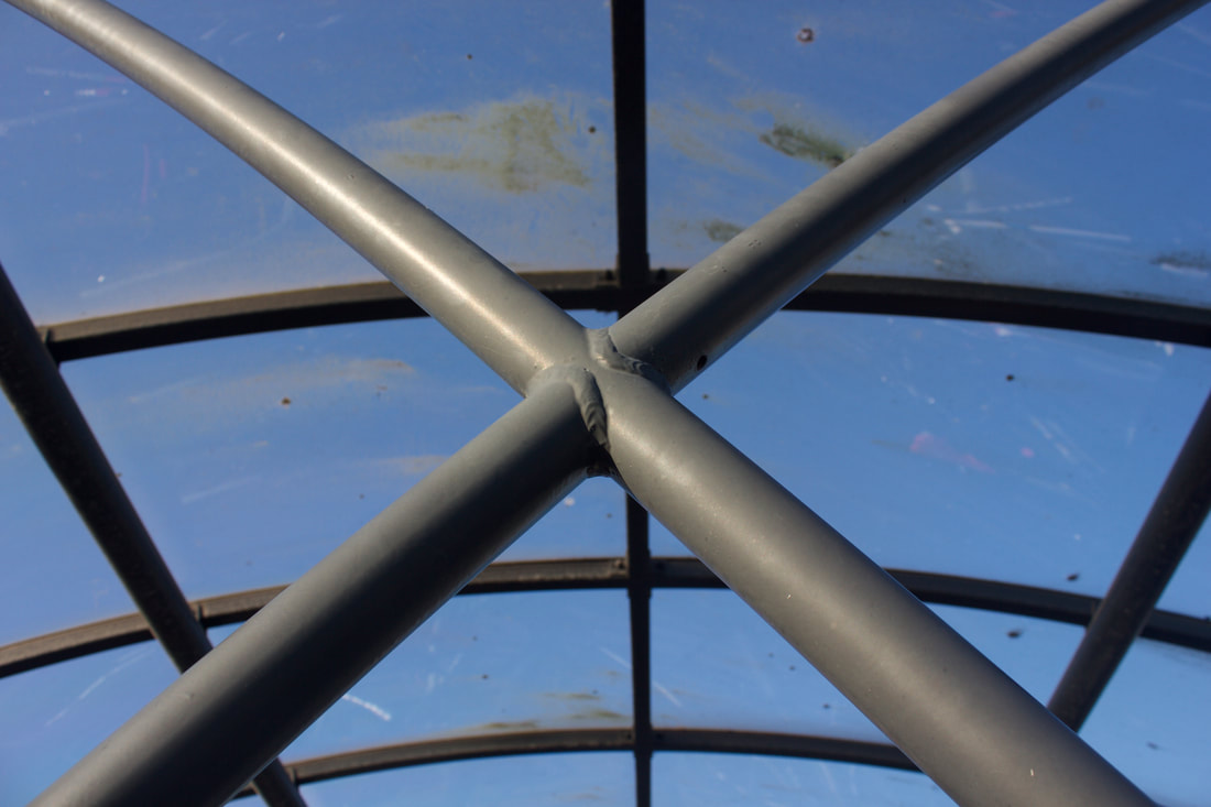
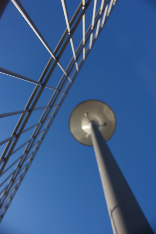
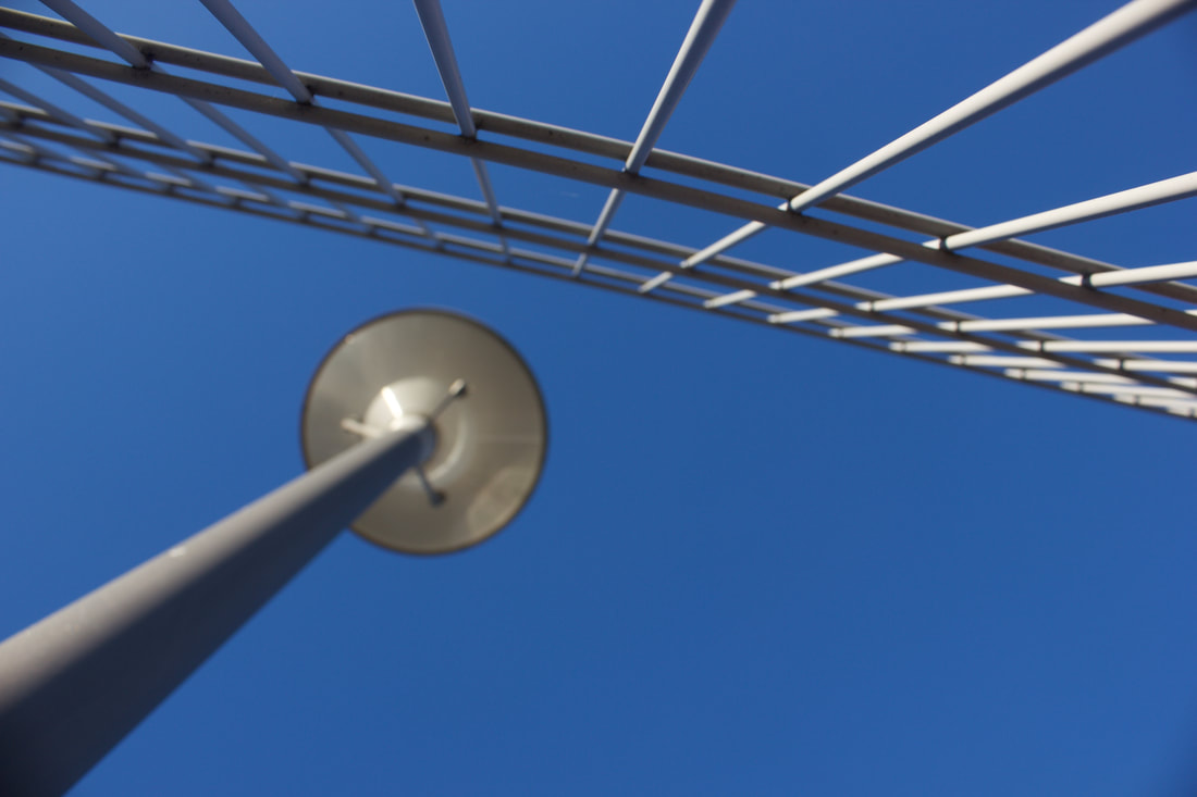
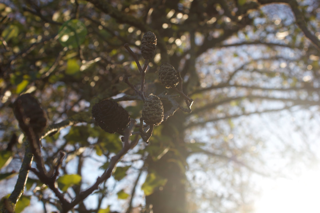
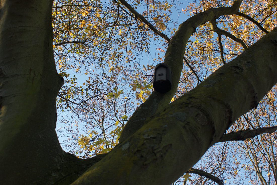
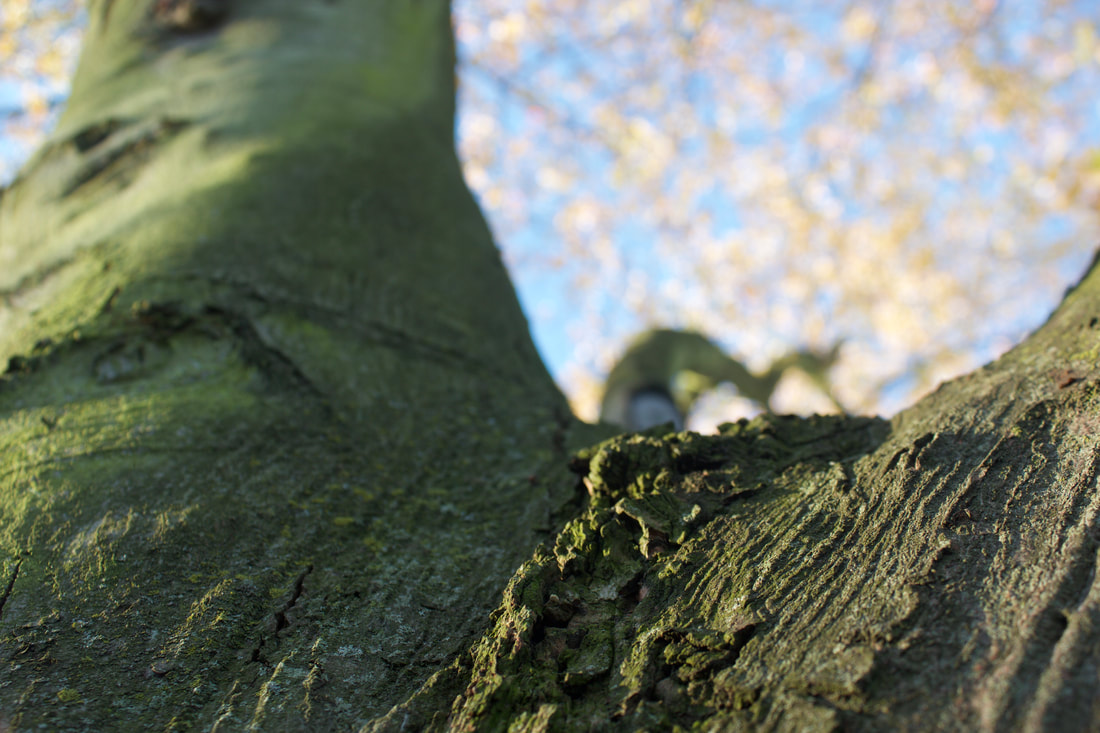
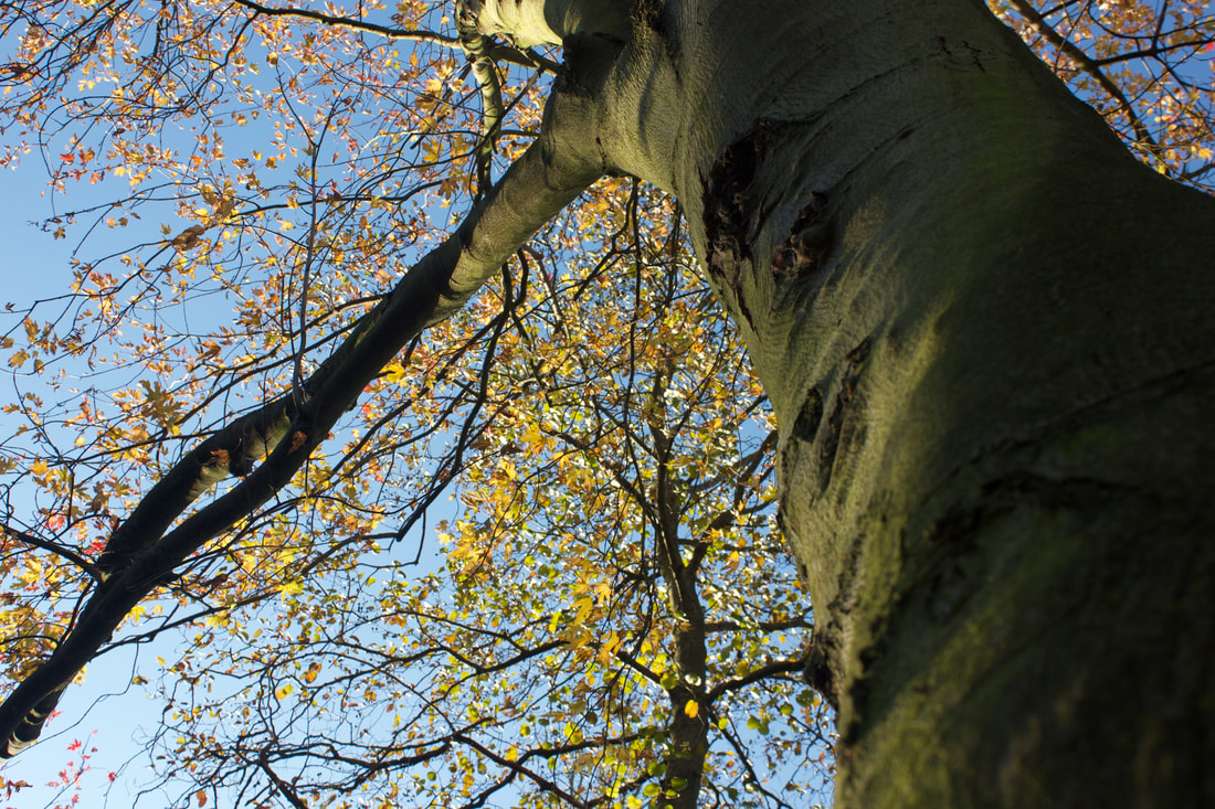
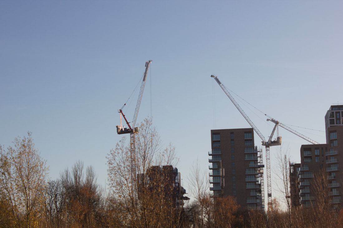
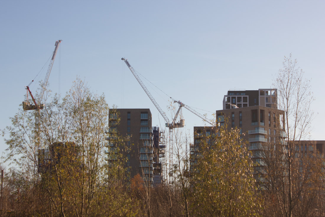
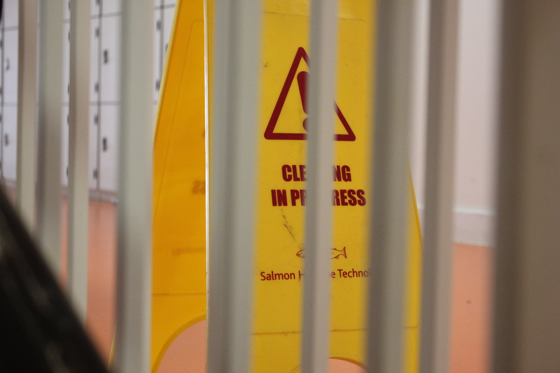
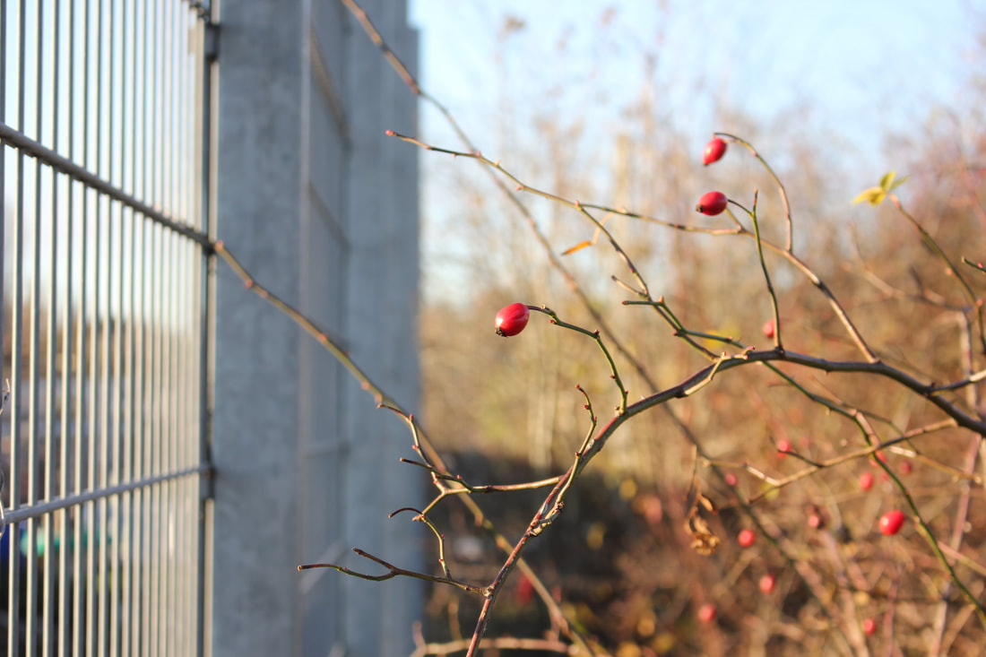
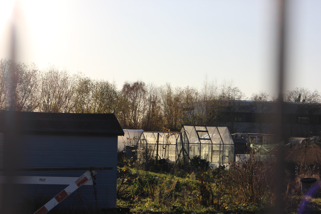
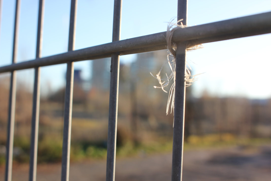
The photographs i have taken inspired by Keld, show many different line works, I have done that purposely for the increase in contrast to have a bigger effect on the abstractness of the photos. I have also made a zine with these photos after working on some selected ones in photoshop. They turned out better than I have thought in the way that, I can actually see a good variety of different lines and the white space surrounding them because of the very high contrast.